
By Ben Remington -
August NHL news leaves a lot to be desired, so this summer I’m tackling a fun topic much more exciting than arbitration filings and AHL signings.
The NHL made the full jersey switch to Adidas last season, and much like when they went to Reebok, the third jersey program was scrapped for a season while teams got two new jerseys each.
With the program restarting this season, a handful of teams have dipped their toes in the third jersey waters so far, but most of the league still hasn’t decided on a third jersey. So I took the liberty of finding or designing a third jersey for nearly every NHL team, even those who have already announced a new design.
I started off with the Atlantic Division, last week tackled the Metropolitan Division, continued on with the Central Division and this week, I'm finishing on the Pacific Division.
Anaheim Ducks
The Ducks came out with third jerseys this season to commemorate their 25th Anniversary. They brought back the beloved Mighty Duck logo, something that I've already done before, but this time not in orange, but rather in black. While I'm a diehard fan of the Mighty Duck logo, the rest of the jersey is far, far too busy for me.
It has too many stripes and colors, as they tried to represent their old silver, eggplant and jade colors while still using their current black and gold color palette. For those keeping score at home, that's SEVEN colors represented on one jersey.
Call me old-fashioned, but that's a few too many.
So I decided to honor the past by using their original striping pattern and that beautiful logo, while keeping with the current color scheme and not going full-blown orange, because the NHL definitely needs less of that.

Arizona Coyotes
The Arizona Coyotes announced their third jersey early this summer, and they couldn't have hit the nail more on the head. The Kachina Coyote jersey screams Southwest. Even though we should enjoy throwbacks in moderation (ahem), I love it.
Calgary Flames
The Flames have plenty of options for their third jersey from their history, just you know, not this one. But as they've done plenty of times in the past, they should go with a classic.

Edmonton Oilers
The Oilers made the decision to go to an orange jersey last season with Adidas. They need to right this wrong and bring their old blue jerseys back as an "alternate" that will undoubtedly unseat the orange as their primary jersey eventually.
http://www.surlebanc.ca/wp-content/uploads/2017/09/akb116398704-jpg.jpg
Los Angeles Kings
The Kings have tinkered with their jerseys a fair amount over the years.
But as usual, the originals are usually the best, and at the same time, the Gretzky era black and silver might be my favorite version. The current jerseys aren't half bad either, so I decided to smash together all three.
This can be done by using the old 'forum blue' jersey logo, the striping from the Gretzky era and the current logo as a shoulder patch. I think it brings together all of those eras quite nicely.

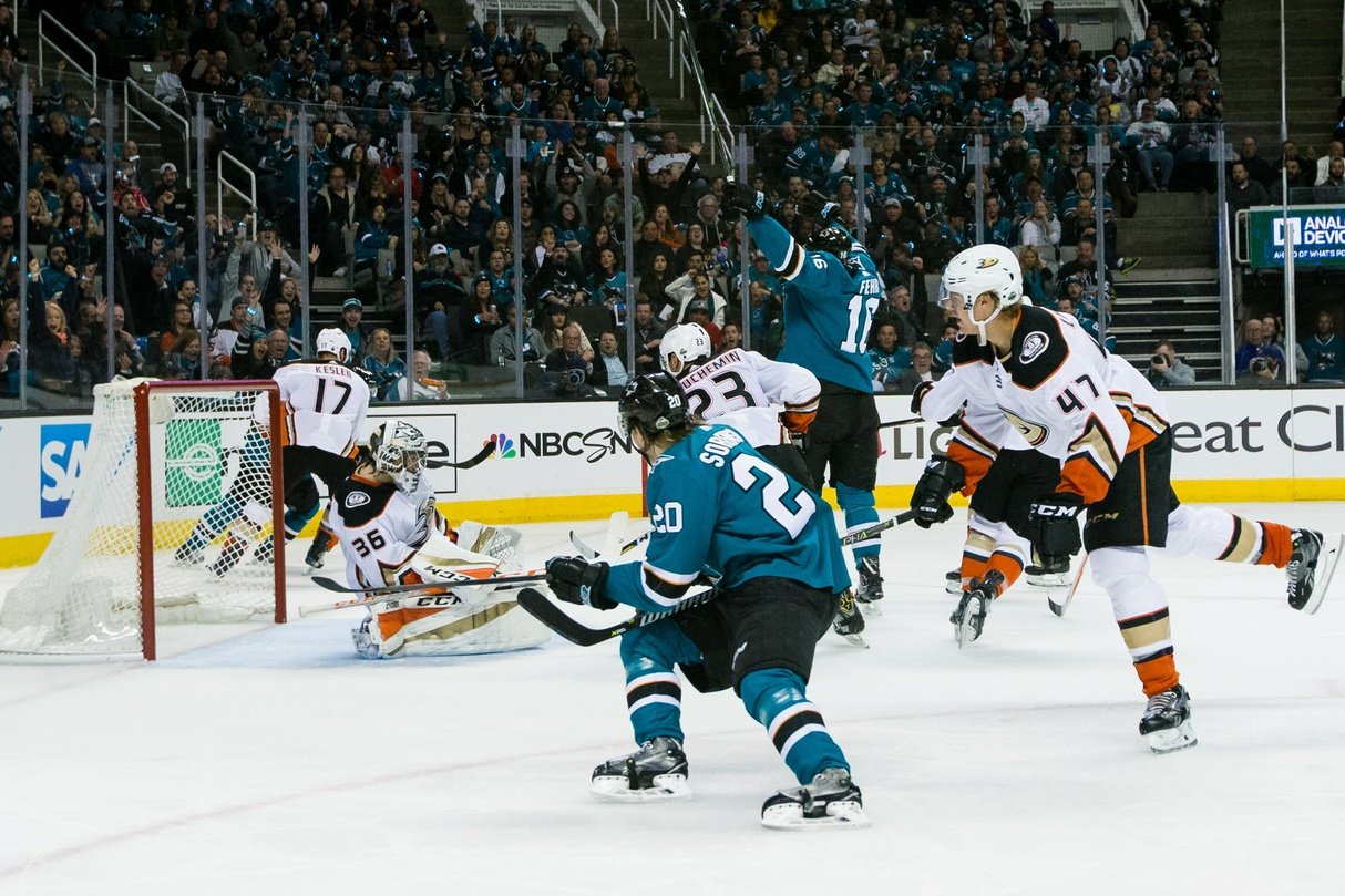
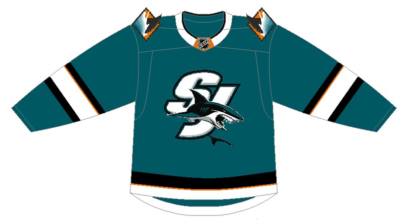
San Jose Sharks
Even in previous iterations, the Sharks have always used the same logo on their crest on their third jerseys. So I mixed things up a bit by using one of their alternate logos with the 'SJ' for San Jose, their beloved city that has never been represented on their crest logo before.
From there, I used their hint of orange striping pattern and added another alternate logo with the shark fin -- that hadn't been used on a jersey -- as an update to their original shoulder patch. I stuck with teal for the Sharks, because there's too much orange and black in the world of NHL jerseys right now, and San Jose has made teal their color and stuck with it well beyond its expiration date in the late 90s.
Good for them.
Vancouver Canucks
Vancouver pleased us children of the 90s recently by announcing they were bringing back the flying skate jersey as their alternate for their 50th season. While I love this, I had an idea in mind of using something that they haven't used on a jersey, but I wish they would -- Johnny Canuck.

I kept the old flying skate colors, and even used that logo as a shoulder patch opposite the full Johnny Canuck logo. The crest is also a Johnny Canuck logo, which I'm not exactly sure where it's used, but it's not on any jerseys, as Free Willy still reigns supreme for some reason.
Another thing I brought back was the 'V' on the jersey striping, something that they went a tad overboard with one time, but I think it works in moderation here.
Also, I really like the black, red and yellow color scheme for Vancouver even though it's not their original. But here's another reason: there's a team coming into the league soon that would LOVE to use Blue and Green, and it'd be a wonderful 'Welcome To The Neighborhood' gift if the Canucks were to let them have it.
Vegas Golden Knights
Ah, Vegas. I tried and tried to come up with a suitable red jersey by mixing things up a bit.
I'm not sure Vegas wants to come up with another logo one year into its existence, and striping 'Vegas' diagonally down the jersey in the hockey style didn't look right with only five letters. So I tried to involve the shoulder logo, even though I think it's better off as strictly a shoulder logo.
Even spicing it up with their wordmark just didn't look right.

So I think the best way for Vegas to go is to use their current crest logo, as boring as that sounds, and simply re-color their current jerseys for something fun and new for their fans. I'm actually pretty happy with how it turned out. If Vegas goes with a red alternate jersey, this is the direction I think they should go.

Become a Zone Coverage Member Today!

Think you could write a story like this? Hockey Wilderness wants you to develop your voice, find an audience, and we'll pay you to do it. Just fill out this form.


Recommended Comments
There are no comments to display.
Join the conversation
You can post now and register later. If you have an account, sign in now to post with your account.
Note: Your post will require moderator approval before it will be visible.