

By Tony Abbott -
For almost two decades, the Minnesota Wild remained extremely disciplined when forging their brand identity. At any point between 2000 and 2019, it would have been extremely easy to throw red meat to nostalgic Minnesota North Stars fans with an alternate jersey evoking the state's first NHL club.
That's a lot of free money left on the table. Hell, look how much the Carolina Hurricanes make digging up the corpse of the Hartford Whalers despite needing to cross five state borders to travel from Raleigh to Hartford.
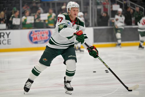
Any proof of how much of a hit a North Stars-themed jersey would be came instantly in 2020 when the Wild unveiled their "78" Reverse Retro jerseys. They wore a white away version for the 2020-21 season and a green home version starting in the 2022-23 season. It's hard to pin down exact sales figures but go to a game at the Xcel Energy Center, and you'll see that these were quite popular.
So why wouldn't the Wild just make these the full-time jerseys? Well, maybe, at least for one day, it seemed like they might. Icethetics, which keeps up with NHL jersey news and reports on potential uniform changes. On Wednesday, the outlet released a video reporting a rumor that the Wild would rebrand to the green-and-gold color scheme for the 2025-26 season.
The Wild swiftly squashed that rumor.
On Twitter, The Athletic's Michael Russo added, "#mnwild have no plans to rebrand. They do plan special things during their 25th season to pay homage to their history, of course." Keyword: 'their' history." Icethetics confirmed the Wild reached out to them with the same information and concedes that he may have "missed on this one," which is something that happens to even the most season reporters.
Still, the reports have re-ignited a battle over the Wild's soul, or at least, their branding. Whether to embrace the green-and-gold North Stars color template full-time or revert to "tradition" with the Forest Green/Iron Range Red color scheme is a divisive topic, even among Hockey Wilderness editors.
It's a can of worms the Minnesota brass kept a tight lid on for 20 years. But now? It's opened, and it's hard to see the debate stopping anytime soon, especially with the "78s" sticking around as an alternate jersey.
There's a line that comes from Mystery Science Theatre 3000: "Never show a good movie in your crappy movie." The Wild violated a version of that rule: Never Put Better Branding In Your Branding.
Wild fans might read that as a shot at the Wild's color scheme and logo, but it's nothing really against the Wild's branding, per se. It has more to do with the fact that the North Stars branding is simply so iconic.
It resonates beyond people who have nostalgia for the North Stars. Sure, you'll find your fair share of 50-year-old dudes in Reverse Retros who will talk about watching Dino Ciccarelli until you find a polite reason to leave. You'll also find many young people with no-stalgia sporting the "78s." They've got an all-ages appeal.
They were also beloved by NHL fans and the media on a national level. The Athletic's staff ranked the Wild's jerseys third of the 31 Reverse Retro uniforms, with an average ranking of 8.6 of 10. And that was a lone dissenter, giving them a 2. Greg Wyshynski of ESPN also placed them in the league's top 10, saying, "We think it looks sharp in the green and yellow, which accentuates some of the logo's details." When the Wild rolled out a color swap, Wyshynski gave his review: "No points for creativity, but these remain pretty dope."
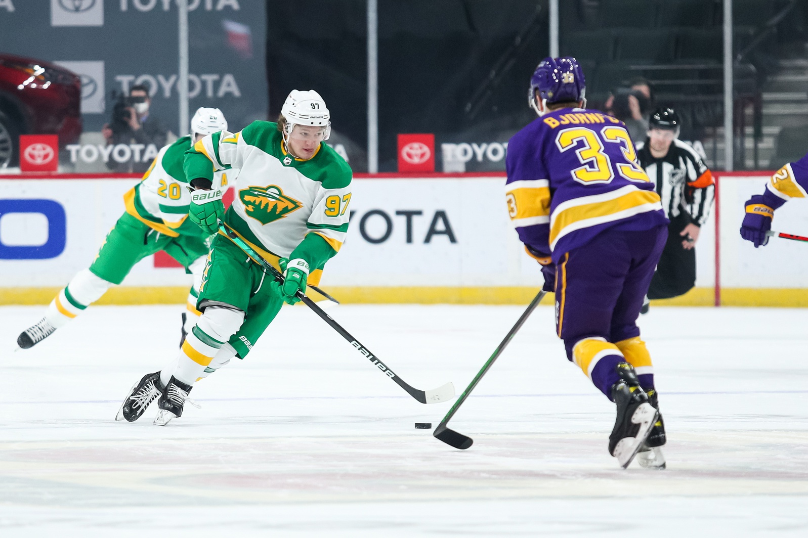
Then there's the experience of watching those Reverse Retros in action on the ice. There's no denying it: that bright green-and-gold scheme just pops. It's not even just about how the colors jump at you; it's how it provides instant, often beautiful contrast with nearly every opponent. If you don't think this Wild-Kings Reverse Retro game is the greatest jersey match-up of all time, congratulations: You have no soul.
But we don't have to look at an all-timer to see how this jersey will work against any team. Let's just look at how it fares against a decent but cookie-cutter Winnipeg Jets uniform set:
Wowza. Even from afar, every Wild player stands out.
Contrast it to a video of their current home greens against the same team in the same duds, and sure, it's fine, but it simply can't compare.
From a distance on TV, it blends in so much with the Navy Blue shoulders of the Jets -- one of the most common colors in NHL uniforms -- that it muddies things up a bit. You can like the colors individually, but you can't deny that the "78s" deliver so much more on contrast that they stand out so much more.
Whether you love one of these jerseys or hate them, whether or not you're sick of the debate, it will rage on. The Wild can't close Pandora's box, and they could barely contain the desire to adopt this iconic branding before they even considered opening it themselves. Now, these "78s" are as much a part of "their" history as their Iron Range Red alternates or their Forest Green script alternates. Until they adopt the North Stars color scheme full-time, this brand identity crisis isn't going away.
Think you could write a story like this? Hockey Wilderness wants you to develop your voice, find an audience, and we'll pay you to do it. Just fill out this form.
-
 1
1
.thumb.jpg.acd5dedd7251543624c6b47bfa6a1212.jpg)


Recommended Comments
Join the conversation
You can post now and register later. If you have an account, sign in now to post with your account.
Note: Your post will require moderator approval before it will be visible.