


By Mikki Tuohy -
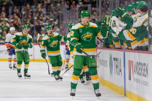
This year is the Minnesota Wild’s 25th anniversary, and there were a lot of nerves leading up to the special jersey reveal this past week. While the Wild have done some cool collaborations and merchandise in the past, it has been…lacking… in comparison to other teams.
On the one hand, it makes sense. Why put in extra effort when the State of Hockey will buy the merch no matter what? But fans have been pining for something good.
The reverse retro jerseys a few years ago, which morphed into the ’78s that the Wild wear as their alternate jerseys, were divisive, to say the least. Throwing back to the North Star days was a gamble. While I personally like the call-back, some fans didn’t appreciate the reminder of the team that abandoned Minnesota to become one of our biggest rivals.
Add to that the range of jerseys that NHL teams have been revealing in the past few weeks. Some were only tastefully different, such as the beautiful embroidery on the Detroit Red Wings' centennial jerseys. Some were wacky and fun, like the Seattle Kraken’s new glow-in-the-dark jerseys. The Edmonton Oilers opted for tan as their third jersey, while the St. Louis Blues revamped their Blue Note.
With only 25 years of heritage to draw from, but an immense amount of hockey pride, the Wild had to create a throwback jersey to celebrate, while also elevating it. They managed to do just that with the 25th Anniversary Jerseys.
Using the original font and script, the Wild created a revamped version of the iconic, original jersey. These jerseys look sharp, but to take them up a notch, they added a strip of gold trim instead of the original, subdued Harvest Gold. The new trim is sparkly and noticeable without looking too “soft” or flashy. Who would want to wear a full gold jersey anyway?
Were There Any Other Options?
There were a few other things that the Wild could’ve done with these jerseys, the most obvious one being to bring back the Iron Range Red that the team rocked in various versions from 2003 through 2017. The distinctive red has been almost non-existent in current jerseys. Could a full-on red jersey make a splash? Or would it be too much?
The other jersey that fans loved, but may be too “recent” to use for this anniversary, was the Winter Classic with the fun and completely different MPLS/ST. PAUL logo. The Winter Classic was only in 2022, so it makes sense that the Wild organization would want to reach a bit further back into the archives for this one. Could we see it on the 50th anniversary jersey in another 25 years? I hope so.
So What’s the Final Verdict?
Honestly, these rank about a 7.5 or maybe an 8 out of 10 because they are a fun throwback with just a little extra oomph. The only thing that could make this better would be a line of merch to go along with it. Could that be coming in the next few weeks? I hope so because I’m already jealous of the amazing sweaters and jackets that New York Rangers fans got in conjunction with their centennial jerseys, and I need something similar.
Think you could write a story like this? Hockey Wilderness wants you to develop your voice, find an audience, and we'll pay you to do it. Just fill out this form.


Recommended Comments
Join the conversation
You can post now and register later. If you have an account, sign in now to post with your account.
Note: Your post will require moderator approval before it will be visible.