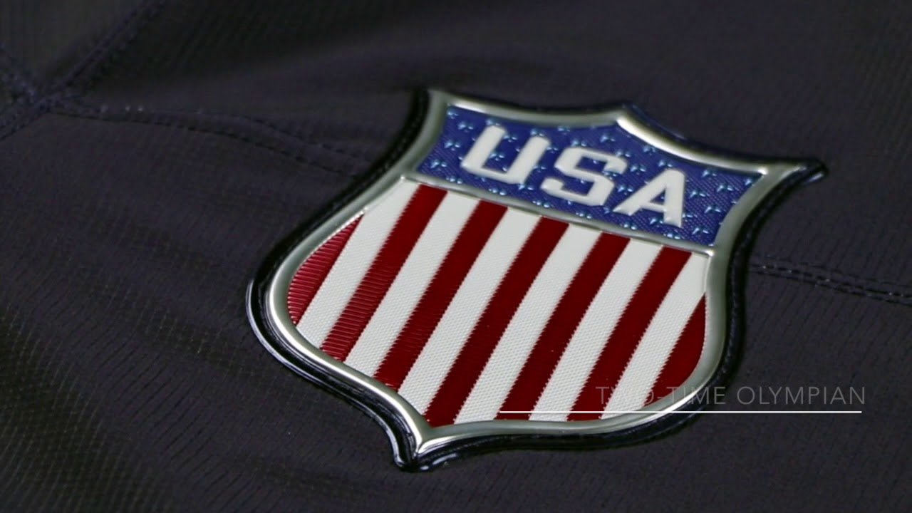
Last week, the 2018 Olympic hockey jerseys were released by Nike.
As you heard on the latest Giles and the Goalie podcast, there were some very strong opinions on these jerseys. Basically this cries out "The 90's era of jerseys are coming back!"

So, let's try and get after it and review each country.
Canada:
http://storage-cube.quebecormedia.com/v1/thn_prod/the_hockey_news/958143ffa0cefe75e7a225add6df05e8ac7ddbdb/3Up-Canada-Horizontal-native-1600.jpg
Ben: The sleeves look like body armor
 Giles: Honestly, why is Canada still going with black? Red and white -- always. Also, how can you screw up the leaf crest like Nike did here?!
Czech Republic:
http://storage-cube.quebecormedia.com/v1/thn_prod/the_hockey_news/c93fbd6e458a22aff572863855c6761aaadcc4c2/Screen-Shot-2017-11-05-at-9-49-25-AM.png
Ben: If the stupid stuff on the Team USA sleeves was supposed to be eagle feathers, why did they do it to everyone else, too? What is that design, vicious Czech shark teeth?
Giles: Not a fan of the white shoulders on the red jersey. Jagr probably would have made this look good somehow, but we don't get to see him play.
Finland:
http://storage-cube.quebecormedia.com/v1/thn_prod/the_hockey_news/888e6a0cac00aee71ee0a0497e1bf38ca69e89a0/Screen-Shot-2017-11-05-at-9-47-54-AM.png
Ben: On the bright side, Nike went more minimalistic with the jersey crests this year, but I almost feel like that takes away from Finland, whose usual 'Suomi' on the front is their calling card.
Giles: Great crest, but again the sleeves just kill this jersey. Let me guess, the sleeves represent lion claws?
Germany:
http://storage-cube.quebecormedia.com/v1/thn_prod/the_hockey_news/05e493c2f4364738dcbefe8ebbe20e591ad36d1d/Screen-Shot-2017-11-05-at-9-48-16-AM.png
Ben: I hope Germany doesn't wear their yellow jerseys very often, because outside of Sweden and the Minnesota Golden Gophers, it's never really a good look. Also, ask a German what 'Germany' is and they'll have no freaking clue. Why did Nike English-ize them only? Should say B.R.D.
Giles: You have a perfectly good crest on the right shoulder of the jersey, and for whatever reason, it got shoved up onto the right shoulder. Awful, awful usage of that great logo. Good to see they put some actual German words on the collar where no one will see it.
Japan:
http://storage-cube.quebecormedia.com/v1/thn_prod/the_hockey_news/fa48d71f5ec1774ea62bc75dd8d6886730a4ccd2/Screen-Shot-2017-11-05-at-9-50-49-AM.png
Ben: It's a shame Japan hasn't found more of an Olympic aesthetic identity, and this cookie cutter jersey really doesn't help.
Giles: Whoever made this did not go far from EA Sports' NHL version of Japan's jersey. Honestly, so lazy.
Norway:
http://storage-cube.quebecormedia.com/v1/thn_prod/the_hockey_news/e4f7d4627272087c2fceaab2a92e92bfa015062f/Screen-Shot-2017-11-05-at-9-48-03-AM.png
Ben: There's no way I don't see this jersey and not yell "NORGE!"
Giles: Viking. Ghost. Ship.
Also, SKOL baby!
Russia:
http://storage-cube.quebecormedia.com/v1/thn_prod/the_hockey_news/2353c75b36ac4da4708b7374ed90f3bfa33da081/Screen-Shot-2017-11-05-at-9-48-33-AM.pngBen: This was supposed to pay homage to the 'Big Red Machine' years of the USSR. If that's the case, why didn't you just copy one of those classic, beautiful jerseys?
Giles: For the team that will probably win it all, they sure do have the blandest looking jerseys out of the lot.
Slovakia:
http://storage-cube.quebecormedia.com/v1/thn_prod/the_hockey_news/aebc89751fe11eca726a099bc450964249e82629/Screen-Shot-2017-11-05-at-9-48-50-AM.png
Ben: The Slovaks were one of the few teams without a matching jersey to someone else, but no, that doesn't mean it looks good.
Giles: Again, why did you shove the crest up onto the right shoulder?! DO NOT FIX SOMETHING THAT IS NOT BROKEN.
Slovenia:
http://storage-cube.quebecormedia.com/v1/thn_prod/the_hockey_news/311b558436dc0e179f6dd5a22da138248c027b3d/Screen-Shot-2017-11-05-at-9-49-08-AM.png
Ben: In an Olympic lineup that all looks very soccer-ish, this one is the most soccer-y.
Giles: Anze Kopitar is probably glad he won't be wearing this jersey. Bad look. Also, don't listen to Ben on "soccer-y".
South Korea:
http://storage-cube.quebecormedia.com/v1/thn_prod/the_hockey_news/8bb8f1b2b22a92336d519164baaeb8117a866ab0/Screen-Shot-2017-11-05-at-9-49-54-AM.png
Ben: If you ever wanted your alarm clock to spell 'Korea' while sitting between individual sheets of paper, here you go.
Giles: Welcome to the Olympic hockey tournament, South Korea! Here is the monstrosity you get to wear! Ben said it best on the podcast: why is there a Dunder Mifflin paper warehouse going on out front?

Sweden:
http://storage-cube.quebecormedia.com/v1/thn_prod/the_hockey_news/43c7ea127e831514e5e4933238705c624deb0e75/Screen-Shot-2017-11-05-at-9-47-36-AM.png
Ben: Nike even managed to mess up Sweden's usually classic and beautiful look, by putting a bunch of gradient crap on the sleeves. Luckily, it's not as noticeable as other countries.
Giles: Sweden almost gets away unscathed here, but Nike leave their imprint on the sleeves. NEVER. EVER. MESS. WITH. SWEDEN'S. JERSEY.
Switzerland:
http://storage-cube.quebecormedia.com/v1/thn_prod/the_hockey_news/650bb8f539cf1af753fc0869b74ae5f8916ad625/Screen-Shot-2017-11-05-at-9-49-42-AM.png
Ben: Another issue I have with these jerseys is that they're so cookie cutter. The stupid sleeve features are the same for the Czech, Swiss and Norway, while Russia, Korea, Canada and Slovenia share a common template and Finland, Germany and Japan are all the same. What gives?
Giles: Good crest, but just another bland look. As said on the podcast, just put the Chur crest on the sleeves or something to spice it up.
United States:
http://storage-cube.quebecormedia.com/v1/thn_prod/the_hockey_news/a93339b5552208097a83624a4d740149a738095f/3Up-USA-vh16-native-1600.jpg
Ben: U.S.A. W.T.F.
Giles: 
Never Miss an Episode of Giles & The Goalie!
Think you could write a story like this? Hockey Wilderness wants you to develop your voice, find an audience, and we'll pay you to do it. Just fill out this form.




.thumb.jpg.acd5dedd7251543624c6b47bfa6a1212.jpg)

Recommended Comments
There are no comments to display.
Join the conversation
You can post now and register later. If you have an account, sign in now to post with your account.
Note: Your post will require moderator approval before it will be visible.