

By Ben Remington -
August NHL news leaves a lot to be desired, so this summer I'm tackling a fun topic much more exciting than arbitration filings and AHL signings.
The NHL made the full jersey switch to Adidas last season, and much like when they went to Reebok, the third jersey program was scrapped for a season while teams got two new jerseys each.
With the program restarting this season, a handful of teams have dipped their toes in the third jersey waters so far, but most of the league still hasn't decided on a third jersey. So I took the liberty of finding or designing a third jersey for nearly every NHL team, even those who have already announced a new design.
I'm starting off this week with the Atlantic Division.
Boston Bruins
This one was pretty easy. I'm a low-key fan of the Bruins look, and they've done a good job of tweaking their classic look to keep it from looking dated over the years. However, some of the classic jerseys are still beautiful to this day, which is why I would avoid doing something weird and go to the Ray Bourque-era black jerseys.

The spoked B was still yellow back then, and the striping pattern was blissfully simple. They've gone back to the well on old jerseys as an alternate several times now since third jerseys became a thing, and this one is one they haven't used yet, but have good reason to.
It's also worth noting that during their last Stadium Series appearance the Alumni game sported these jerseys.
Buffalo Sabres
Ah, the Sabres.
While they have plenty of history to choose from -- some good, some very, very bad -- I wanted to mix in that history a bit. I've always been a huge fan of the Dominic Hasek-era black jersey, even though they were a peak embodiment of late 90's, and I've also always thought that the Sabres should have remained royal blue and yellow. So I came up with this.

Now this is certainly the best that my Microsoft Paint skills have to offer. But as you can tell from the logos I found online, I'm not the first person to think of this logo in this color combination. The jersey design where the logo came from made by KP8 Design, may even be a better option than mine, although I've never been keen on the front chest numbers.
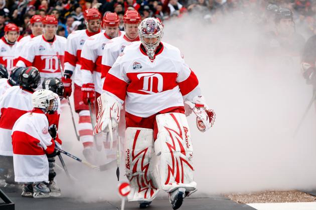
Detroit Red Wings
The Red Wings have never had a regular third jersey, with the exception of a few special occasions, but never anything that they've used beyond one game or even one season. So, as much as it pains me to not meddle with a beautiful crest such as theirs, I'm not going to. The Red Wings should stick with tradition, and not succumb to the third jersey.
Florida Panthers
I've long made fun of the Panthers and their redesign, 'Solemn Nala' jerseys. My favorite criticism is how soccer-y the logo looks, so with that in mind, I created this, tongue firmly planted in cheek.

Get it? It looks like a soccer kit! Even the tan color lends itself well here.
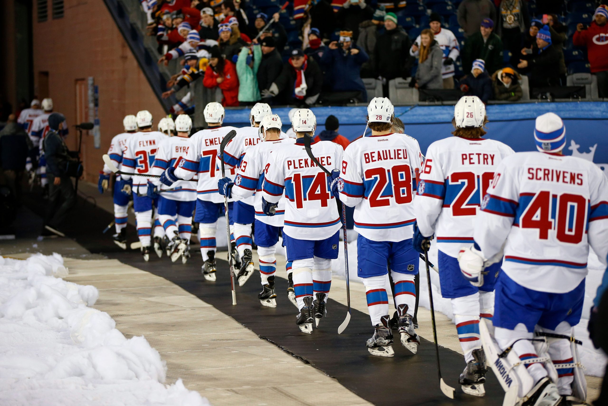
Montreal Canadiens
I'm also going to take the high road with the Habs here, as they have also never worn a third jersey regularly. I thought about inverting their jersey colors to create a beautiful blue jersey with a red stripe. But seeing as how things are going in Montreal lately, I think they've been through enough pain, and there's a blue team not too far away that their fans aren't particularly fond of.
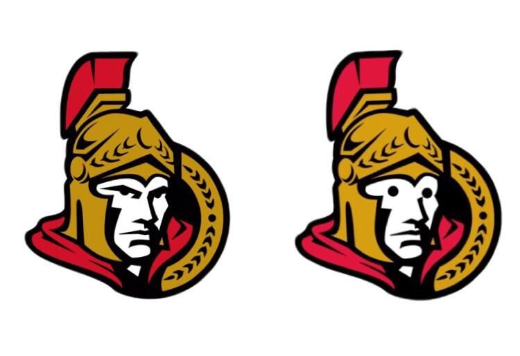
Ottawa Senators
While it would be hilarious and fitting to feature some kind of burning tires symbolism here, I'm also going to go easy on Senator fans. They have undoubtedly suffered enough, even before Erik Karlsson is eventually traded. The Senators need a redesign on their whole set like Eugene Melnyk needs to sell the team, and I think I've got a decent idea.
You see, there was a jersey a few years back that just said 'SENS' on the front. And while it was a terrible, stupid jersey, it featured a not very well-known shoulder patch that I rather like. It's a logo that updates their original logo, without looking sneering or goofy like their current logo.

Not bad, right? So I slapped said logo on a jersey that mirrors their original jerseys from the 90's, and for good measure, used the shoulder patch featured on their current jerseys. This effectively ties all of their jersey history together into something that looks much classier than their current look.
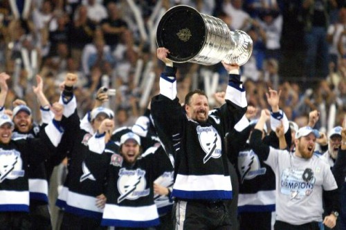
Tampa Bay Lightning
The Lightning have also long tormented their fans with another ill-conceived jersey featuring a name that isn't actually theirs. So to put an end to this madness, I did what the 'Bolts' should have done, and honor their past with a black jersey that also keeps in line with Steve Yzerman's desire for a simple, classic look. I also made a new simple shoulder patch that also calls back to the original, but simplified.

Toronto Maple Leafs
The Leafs just underwent a historic redesign a few years back, back to a more dendrologically-accurate leaf design after mimicking the Canadian flag since 1967. But just as they usually featured third jerseys with their original leaf design during those years, I'd like to see them flip the script and feature the 67-16 leaf as an alternate, by wearing the Mats Sundin-Felix Potvin era jerseys again.
/cdn.vox-cdn.com/uploads/chorus_image/image/57657913/72326562.0.jpg)
Yes, even the jerseys with the weird, bubbly numbers. They really could pick from any of the years in the 67-16 gambit, as the jersey was pretty similar for most of those years. If they did pick another design, they could go really classic looking with the 1970-92 design, as it did have the longest run as a consistent design for them.
http://cdn1.sbnation.com/imported_assets/316651/clark921.jpg
Either way, seeing Auston Matthews and company in the jerseys that most of us grew up with would be quite a treat, and wouldn't stomp on any traditions that the Leafs have used.
Look forward to the Metropolitan Division third jerseys next week!
Become a Zone Coverage Member Today!

Think you could write a story like this? Hockey Wilderness wants you to develop your voice, find an audience, and we'll pay you to do it. Just fill out this form.
.thumb.jpg.80e10d73a1a36997641eb63107ea3d25.jpg)


Recommended Comments
There are no comments to display.
Join the conversation
You can post now and register later. If you have an account, sign in now to post with your account.
Note: Your post will require moderator approval before it will be visible.