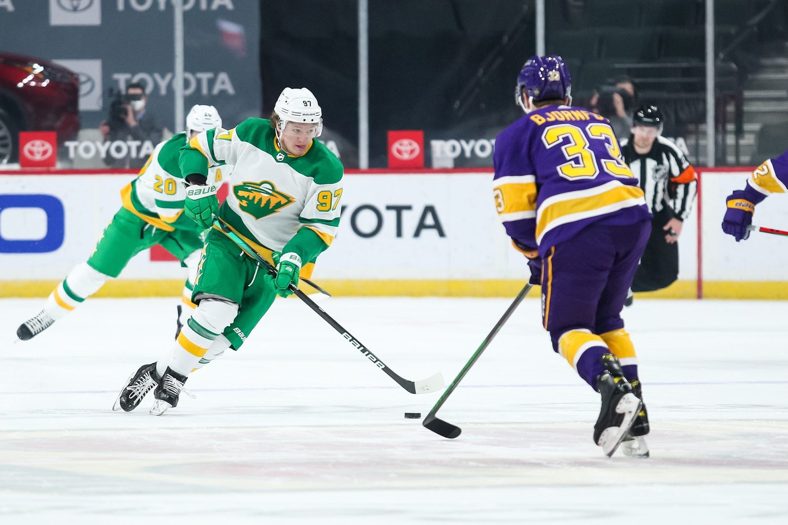
The Minnesota Wild recently debuted their newest reverse retro jersey. It is essentially a color-swapped version of the first series of reverse retro jerseys, this time with green dominating over white. And why mess with success? These jerseys are getting a ton of love on social media, even with the national media. So why go back? The North Star colors should simply become the Wild colors.
There’s nothing wrong with Minnesota’s current jerseys, but it’s been so long since the Wild have had something new. The road sweaters have been the same since 2013, and the home jerseys have been the same since 2017, so it’s time for a change.
Minnesota’s reverse retro jerseys are exactly the kind of change the Wild need. The first North Stars-inspired one they released, the primary white jersey, had rave reviews and sold out fast. Sure, detractors said it reminds them of Subway’s colors, but they ate their words when they saw how fresh they looked on the ice. Besides, fans have always dismissed the Wild’s current color scheme as Christmas colors, but they still sell.
https://www.instagram.com/p/CL-9w59sN2b/?utm_source=ig_web_copy_link
The current away jerseys are very clean-looking, but there’s nothing extraordinary about them. Basic colors, primarily dark green and white, and basic striping as well. They are classic Wild colors, but nothing stands out about them.
https://www.instagram.com/p/CkxNyLIOrhK/?utm_source=ig_web_copy_link
Contrast those with the 2020 retros, which bring a fun jersey matchup with whoever they’re up against. Whether it’s a good matchup or they clash, the North Stars' colors are brighter and stand out more, even in the white away sets. Two years ago, the all-Reverse Retro matchup against the Los Angeles Kings looked absolutely fantastic on the ice. The State of Hockey could have this every night!
Plus, the overall look for the away reverse retro is a massive win. The gloves, the breezers with the stars, it all looks so good. The execution was phenomenal. No one talks about breezers, socks, or gloves with the Iron Range Red set. Use what generates buzz!
The newest batch of reverse retros went exactly how Wild fans wanted; they went with the solid North Star green home jersey. Everybody expected it and loved it just as much as the first version. The entire uniform looks fantastic on the ice. The solid green stands out in a good way, and just like the away setup, the home uniform also looks clean and sharp.
Plus, they're completely unique in the world of professional hockey. These colors haven’t been in the NHL for a long time. It’s something different, and fans love the nostalgia these jerseys evoke. These colors also arguably work better for merch. The hats are cooler, and the hoodies are more fun. Fans go nuts over anything with the North Stars colors, and a big reason is that they simply work.
Now that the Wild have a full set of home and away jerseys with the North Stars colors, they should just stick with it. People enjoy these colors more. When you look at the crowd at the X, you almost always notice that everyone is wearing a different color. That’s because the Wild have had so many different primary jersey colors: red, green, then another green Adidas released around 2010, whatever that Winter Classic getup was.
The Wild have tried so many looks because nothing quite resonates with the fans like that perfect green and gold. It would be awesome if the Wild wore these reverse retro jerseys full-time. The fans could get the crowd into a sea of light green and yellow instead of a random mix of colors.
Another plus with these colors is the goalie setup. Marc-Andre Fleury’s gear is incredible. His mask is a tribute to former North Stars Goalie Gillies Meloche.
Fleury went with an all-yellow setup with the rest of his gear. His goalie stick is a stunning shade of green too. His overall setup is fantastic.
Filip Gustavsson’s gear is even more attention-grabbing. His pads are throwbacks to what goalies wore in the past. Combined with the retro uniforms, it’s got nostalgia written all over it.
Adidas recently announced that they will no longer be the NHL’s primary jersey supplier once their contract is up in 2024. It’s still uncertain who is going to take over. Nike, CCM, and Under Armor are currently in the running.
Since Adidas went with a minor overhaul of the jerseys when they took over, it’s safe to say that the next suppliers will likely do the same. The Wild’s last batch of new jerseys was not too different from what they were already wearing. This brand change would allow the Wild to go with the throwback colors full-time. They can eventually add a forest green alternate jersey similar to the current homes.
Now is the time for a change. The Wild’s jerseys have been serviceable through the years, but there is something about the North Stars' colors that everyone can get behind. Every professional team goes through the occasional uniform change, and the Wild have already had their share of overhauls. What's the downside in one more? Look at it on the ice, and you'll see none.
Think you could write a story like this? Hockey Wilderness wants you to develop your voice, find an audience, and we'll pay you to do it. Just fill out this form.


Recommended Comments
There are no comments to display.
Join the conversation
You can post now and register later. If you have an account, sign in now to post with your account.
Note: Your post will require moderator approval before it will be visible.