
By Ben Remington -
August NHL news leaves a lot to be desired, so this summer I’m tackling a fun topic much more exciting than arbitration filings and AHL signings.
The NHL made the full jersey switch to Adidas last season, and much like when they went to Reebok, the third jersey program was scrapped for a season while teams got two new jerseys each.
With the program restarting this season, a handful of teams have dipped their toes in the third jersey waters so far, but most of the league still hasn’t decided on a third jersey. So I took the liberty of finding or designing a third jersey for nearly every NHL team, even those who have already announced a new design.
I started off with the Atlantic Division, last week tackled the Metropolitan Division, but this week, I get to handle something closer to home: the Central Division.
Chicago Blackhawks
The Blackhawks haven't waded much into the third jersey market, and given the fact that they play an outdoor game each and every season, they haven't really needed to. So if they were to go into an alternate jersey again, it'd be a shame if they messed with the beautiful template they're using for home and away jerseys right now, which is why I'd recommend they just go back to this number.
http://a.espncdn.com/photo/2009/1205/chi_g_hawks10_800.jpg
Is this a little boring and unimaginative? Sure, I suppose, but I also don't want to see some goofy interpretation of their classic logo sullied by overzealous design. The caveat to that is that the Blackhawks will be celebrating 100 years in 2026, so maybe going back to their original uniforms would be pretty dang cool.
Colorado Avalanche
The Avalanche were one of the big winners of the Adidas takeover, moving back to a design more like their originals and less Reebok-tainted.
Something worth saving from the Reebok years, however, is the alternate logo that was based from their Stadium Series jersey that later became a part of their alternate uniform. I'm not suggesting they go back to that design completely, since I found it a tad bland, and the white shoulder yoke entirely unnecessary.
But I do love how the alternate logo evokes memories of the Colorado Rockies hockey team logo, and how it's actually a cleaner, classier look than their current logo.

So I slapped that logo on their current striping format, and made the jersey navy to complement the alternate logo better. Since the alternate and current logos share a resemblance, I decided to un-retire the Yeti foot for the shoulder patch for this jersey, slightly adjusting its color to make it fit in a little better.
Dallas Stars
Everyone loves nostalgia, myself included, but sometimes nostalgic things just need a bit of an update to fit in.
I always liked the Stars' Stanley Cup-winning jerseys, no matter how much I hated the name-stealing pigdog of a team, but they just would look dated if carried over to the present day. So I recreated them in "Victory Green" and slapped the -- admittedly lackluster -- current logo in the middle instead, and I think it works a little bit.
I also re-worked their shoulder patch a little to include the state of Texas -- like the originals -- rather than the primary logo over again like it is on their current jerseys, which is really boring.

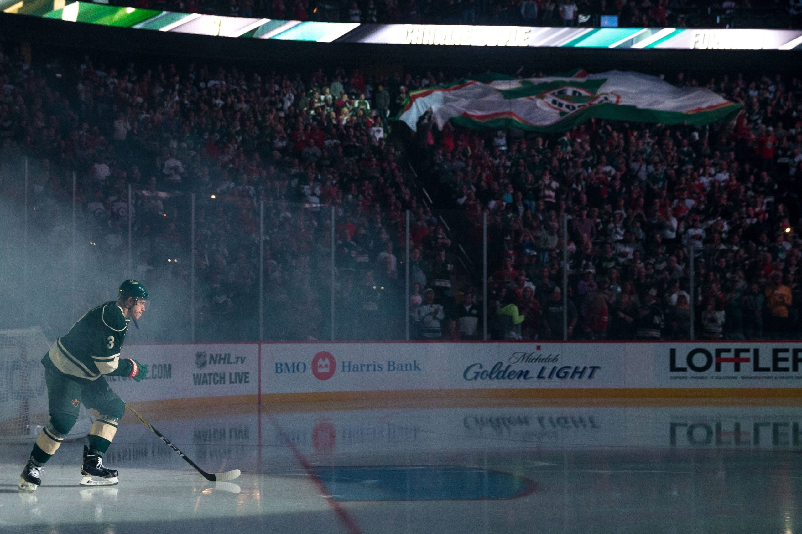
Minnesota Wild
Ladies and gentlemen, the main event.
This reveal might be a little anticlimactic, but bear with me, and really look at the jersey long and hard to see how clean and simple it is. We've heard rumblings of the 'M' logo taken from the old alternates getting a more featured role sometime soon, and red has been basically eliminated from contention for the next Wild third jersey, per a vote given to the season ticket holders.
So I think the next thirds for the Wild are going to look something like this.

It's a pretty simple look, but I like it.
When I first mocked this up I was worried that it was too simple, but then it reminded me of something; the jerseys from the movie Mystery, Alaska. I think these jerseys will work really well, based on the design of the current whites, just without the shoulder yoke.
It'll be interesting to see if the Wild go with a design closely resembling this next season when they're rumored to join the third jersey fray again, but if they do, I'm game.
Nashville Predators
The Preds love their yellow, apparently.
Unfortunately, they use it as a *dark* color in their scheme, which as anyone with eyes can tell you, it is not. This leads to yellow versus white looks for all of their home games, which is rather unfortunate, as it looks awful.
So when it comes to alternates, I didn't want to go yellow, but I respect their ownership of the color, so I included it as much as their current road jerseys, by just essentially filling the white with blue.

The hope here, is that maybe someday the NHL will come to their senses on this whole "white on the road, dark at home" business and flip things back to the way they should be, or better yet, allow color versus color matchups, as the NBA, MLB and NFL have dabbled with. Then this beautiful navy number can be worn on the road, and the Smashville faithful can enjoy their precious yellow jerseys at home, using it as a light color.
St. Louis Blues
The "Gretzky Era" Blues jerseys were actually a short-lived thing, but they'll always hold a special place in our hearts for zesting things up a bit. With that said, the current Blues jerseys are a solid, underrated jersey in the NHL, and I didn't want to stray too far from that either, so I came to a compromise.
I added a touch of red to the current jerseys where some small blue striping exists, flipped them to the darker shade of blue they use, and added the old trumpet shoulder patch, which I absolutely love.
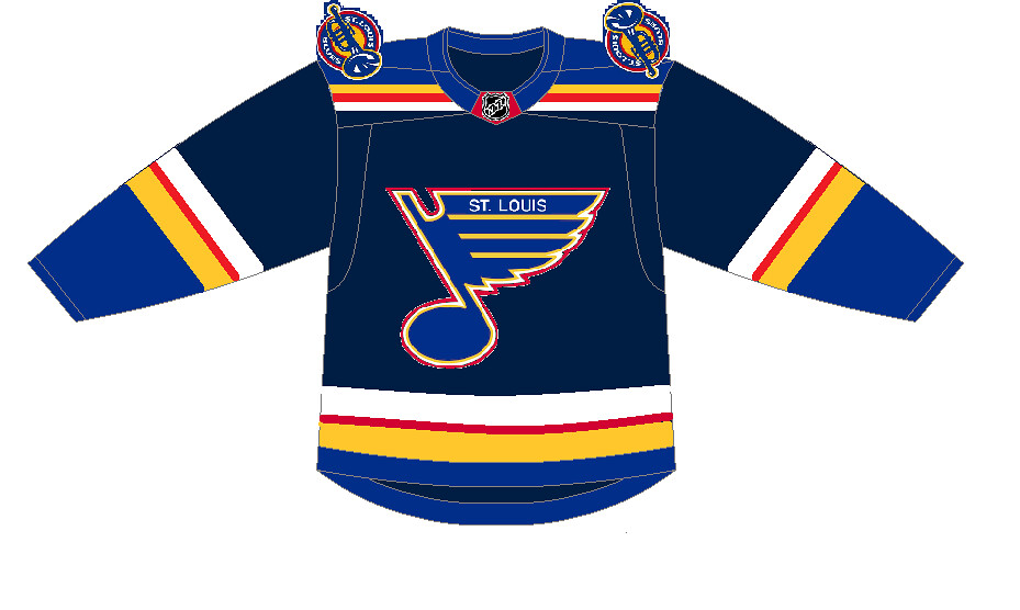
Red was actually a Blues color from 1985-98, so bringing it back isn't exactly earth-shattering, and putting the 'St. Louis' back onto the current, better looking note than the 90's version is a good thing.
All in all, I think this is a fun alternate to break up the blue monotony of the Blues, as silly as that sounds. But third jerseys are supposed to be fun, right?
Winnipeg Jets
I tried to think of a throwback-feeling Jets jersey that would do the legacy of hockey in that city justice, but I just couldn't come up with anything that beats this classic. Since this team hasn't really adorned this jersey, with very limited exceptions, I think it's time they crack them out for their fans multiple times a season.
http://4.bp.blogspot.com/-ZdehtNGRBXE/UfX4KX2Xo8I/AAAAAAAAAaQ/ZNwG4oXHV1c/s1600/tumblr_mj1tyt8dF11s6jt5co1_1280.jpg
Become a Zone Coverage Member Today!

Think you could write a story like this? Hockey Wilderness wants you to develop your voice, find an audience, and we'll pay you to do it. Just fill out this form.


Recommended Comments
There are no comments to display.
Join the conversation
You can post now and register later. If you have an account, sign in now to post with your account.
Note: Your post will require moderator approval before it will be visible.