
By Giles Ferrell -
No, this is not your typical 'The NHL All-Star Game is bad' post.
It's a 'The NHL All-Star Game jersey history is bad' post.
Honestly, taking a closer look at the history of the uniforms worn in this event, and you find yourself cringing more often than not.
But they are not all bad. There are some good ones in the mix, but in typical NHL fashion, they miss way more than they hit.
So before we look at the really bad ones, let's look at the ones that deserve praise as the best.
1984-86
http://nhluniforms.com/AllStar/Images/AllStar86.png
In 1983, the NHL put out a similar version of these uniforms, but in 1984 they were fine-tuned and they are now the most iconic jerseys in the history of the event.
It's hard to believe it took the league this long to put out a good jersey, but in 1984 the NHL finally did right. The Campbell jerseys have gained more fame over time -- because of the player featured in the photo -- but the Wales jerseys are a perfect compliment.
With a primary usage of orange with black trim, the NHL found the perfect balance and mixed in their usual stars up and down the uniform. Great set.
1989-91
http://nhluniforms.com/AllStar/Images/AllStar89.png
The NHL did the smart thing and made one jersey primarily black with orange trim and the other white with black and orange trim. No more stars down the sleeves, but you still get them at the waist and on the socks. Solid look for the peak years of Gretzky vs. Lemieux
2004
http://nhluniforms.com/AllStar/Images/AllStar04.png
This is one thing the NHL should have done but never really got into -- having the host team's colors on display in the jerseys.
Minnesota was the host this year and they went with a more throwback look. The Western Conference went on to be the basis of Minnesota's alternate jerseys from 2009-17. This set has been the best set since 1991.
Everything that has followed has been test product for Reebok and Adidas. Not good at all.
OK, so those were the rare ones that stick out in a positive way. Now onto the bad.
1947-1959
http://nhluniforms.com/AllStar/Images/AllStar52.png
Yeah, in the 40s and 50s jersey design wasn't exactly a pretty thing. So when the NHL introduced the All-Star Game in 1947, these things were created. If anything, these jerseys are for pickup street hockey games on July 4.
Also, the NHL went back to these in 1992 for the 75th anniversary season. The sentiment is understood, but it doesn't mean it looks good.
1982
http://nhluniforms.com/AllStar/Images/AllStar82.png
Why?
1994-96
http://nhluniforms.com/AllStar/Images/AllStar96.png
The NHL uniform structure in the 1990s can be best described in one word -- teal. You know it was out of control when they tried to incorporate it into the freaking Philadelphia Flyers, a team whose colors are BLACK AND ORANGE!
But since this was a league function, you better believe teal was involved. Also, this just dawned on me, but these jerseys had to play a role in the Dallas Stars jersey re-design of the late 90s, right?
1998-1999
http://nhluniforms.com/AllStar/Images/AllStar98.png
These jerseys look like spotlights are coming up from the bottom. It would make sense, if they were playing the game in Los Angeles or something. But they didn't...
2000
http://nhluniforms.com/AllStar/Images/AllStar01.png
For the turn of the century game, the NHL decided that goalies needed different colored uniforms from the rest of their team. This isn't soccer. Very unnecessary.
This game was in Toronto and this was the best you could do?!
2002
http://nhluniforms.com/AllStar/Images/AllStar02.png
Color on color is nice, but why are the armpits being highlighted? No one ever wants that!
2007
http://nhluniforms.com/AllStar/Images/AllStar07.png
With Reebok on the horizon, the NHL tested these new jerseys out for this game. While not bad for this game, the Reebok jerseys and their piping that come after is now noted as a dark era in NHL jersey history.
2009
http://nhluniforms.com/AllStar/Images/AllStar09.png
Nothing says happy 100th season Montreal than this hot garbage. Holy moly there is way too much going on here. The game was in Montreal. Someone clearly was thinking way too hard.
2011-12
http://nhluniforms.com/AllStar/Images/AllStar11.png
The stuff on the back and the sleeves is waaaaaay too much. Dump that, and these don't look all that bad.
2015
http://nhluniforms.com/AllStar/Images/AllStar15.png
The NHL had a three-year hiatus from the All-Star game. So someone literally had three years to come up with this glow in the dark looking product. Woof.
2016
http://nhluniforms.com/AllStar/Images/AllStar16.png
Someone in "Smashville" was clearly 'smashed' while making these jerseys. "Excuse me I have to go and vomit." - Hermione Granger, Harry Potter and the Half-Blood Prince
Well there it is, it's more of an ugly history. And we even left out a lot of the early years that had some eyesores too, just to keep it brief.
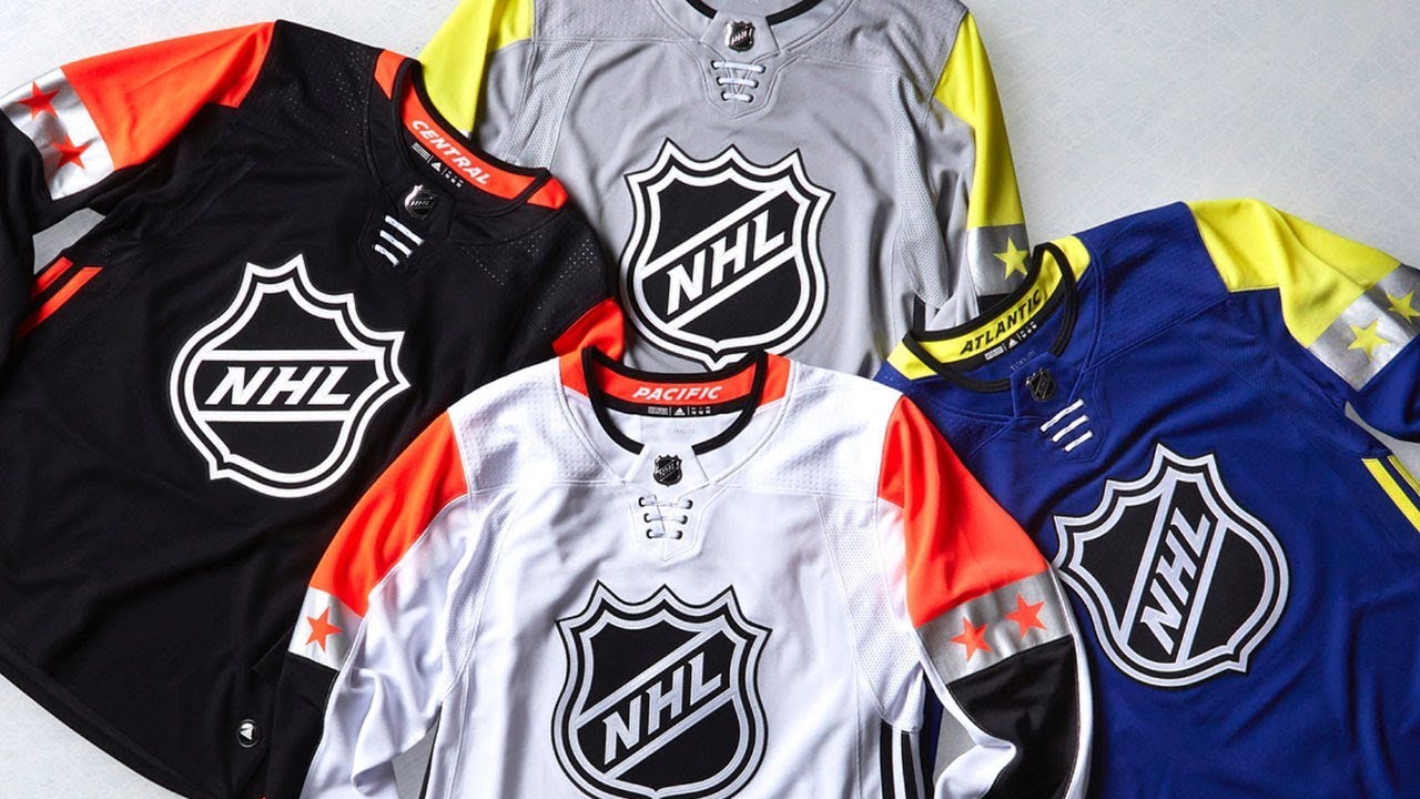
As for the new format with four jerseys, it really makes it tough to do anything well, so you are going to get these bland looking uniforms like we see this season. At some point, it would be nice to see the NHL put out a jersey set in the All-Star game that is actually worth something.
But as we see time and time again, the NHL isn't exactly prone to doing something right...
Jersey pictures in this post courtesy of NHLUniforms.com
Catch Giles talking Wild on Giles & The Goalie!


Think you could write a story like this? Hockey Wilderness wants you to develop your voice, find an audience, and we'll pay you to do it. Just fill out this form.


/cdn.vox-cdn.com/uploads/chorus_image/image/54809429/GettyImages_465172400.0.jpg)
Recommended Comments
There are no comments to display.
Join the conversation
You can post now and register later. If you have an account, sign in now to post with your account.
Note: Your post will require moderator approval before it will be visible.